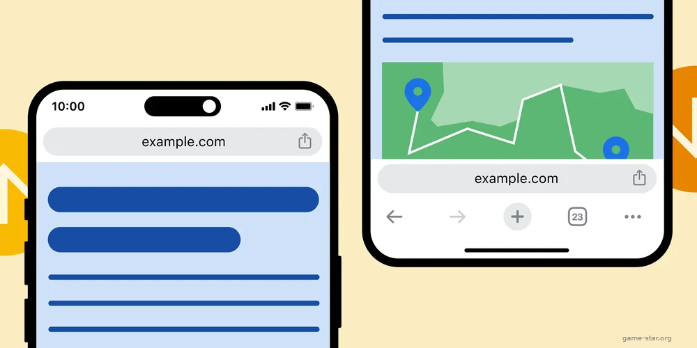
Chrome Revamps iOS Experience: Google Transitions URL Bar to Screen Bottom, Keeps Android Users Guessing
02 Nov 2023

If you've been struggling with the awkward thumb stretch to reach the URL bar while browsing on your phone, Google bears some good news. The tech giant has introduced a design tweak on Chrome for iOS, shifting the address bar to the bottom of the screen. However, the same change is conspicuously missing for Android users, causing a stir since Android is Google's own operating system.
Relocating the address bar to the base of the screen is logically sound, considering the surge in phone sizes. It has increasingly become a stretch to reach the top of the screen, making a bottom-placed URL bar more thumb-friendly, particularly given the frequency of its usage in a typical day.
It is somewhat surprising, though, to see Google prioritizing iOS over Android for this user-friendly feature. Perhaps this can be ascribed to iOS users voicing their need for this feature more fervently, especially since Apple's Safari has embraced this design since 2021.
As for how to activate this new feature in iOS, the process is fairly straightforward. Users simply have to tap, hold, and select 'Move Address Bar to Bottom' when on the address bar. The position can be switched back by following the same process and choosing 'Move Address Bar to Top'. This setting can also be altered in Chrome's settings.
Given the wide variety in screen sizes and designs across Android phones, it's unlikely that this update will stay iOS-exclusive for too long. However, Google's announcement didn't mention a timeline for the feature's Android debut, keeping non-iPhone users in the lurch.
This move comes as part of a series of recent upgrades Google has made to Chrome, including enhancements in autocomplete, typo corrections, bookmark search, and more. This new change brings Chrome closer to its competitor, Safari.


